
Reve 2.0 makes some ambitious claims around image editing, subject consistency, text generation, and 4K output.
But promotional examples do not show how much control you actually get or how many attempts it takes to produce a usable result.
That is why I tested Reve 2.0 across different image-generation and editing tasks. I focused on prompt accuracy, localized changes, image consistency, typography, environmental transformations, and output quality.
I also checked whether the model could refine the same image repeatedly without changing details I wanted to preserve.
In this Reve 2.0 review, I will walk you through the most useful features I found, where the model performed well, and the limitations you should know before using it for professional work.
How I Tested Reve 2.0
I tested Reve 2.0 using a mix of image-generation and editing prompts.
Instead of judging the tool from one successful output, I looked at how it handled different types of requests, including:
- Replacing clothing and accessories
- Editing furniture inside an existing room
- Changing weather and lighting
- Maintaining the same subject across scenes
- Adding multiple people to a composition
- Generating readable text and brand assets
- Exporting high-resolution images
Where possible, I used the same source image for multiple edits. This helped me see whether Reve could preserve the original subject, background, camera angle, and lighting while changing only the requested element.
I also paid attention to details that often reveal problems in AI-generated images, such as faces, hands, text, reflections, object boundaries, and consistency across repeated revisions.
1. Localized Image Editing
Localized editing was one of the first Reve 2.0 capabilities I examined.
The idea is simple: instead of recreating the entire image, you identify a specific object or area and ask the model to change it.
For example, the Reve 2.0 demonstration shows the same dog portrait being modified with different glasses, scarves, and outfits.
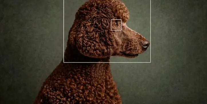
What stood out to me was that the wider composition remained visually similar while individual accessories and clothing changed.
That matters when you already like the overall image but need a few variations. A marketer could change a product color, a designer could test different materials, or a content creator could update a subject’s outfit without rebuilding the scene.
However, localized editing should be judged by more than whether the requested object changes.
You also need to check whether the model:
- Alters the subject’s face or body
- Changes the background unexpectedly
- Introduces blurry edit boundaries
- Modifies the lighting around the selected area
- Reduces quality after repeated edits
My takeaway is that this feature appears most useful for large, clearly defined objects. Smaller details such as jewelry, fingers, hair, or tightly overlapping elements may require closer inspection and multiple attempts.
2. Iterative Image Refinement
Reve 2.0 also lets you continue refining the same image instead of starting from a new prompt every time.
The clearest example is the interior-design sequence.
It begins with a minimal white living room. Furniture, shelves, lighting, colors, flowers, and decorative objects are then introduced across multiple edits.
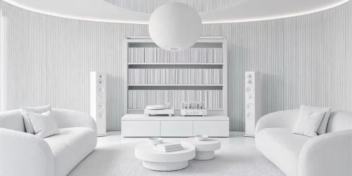
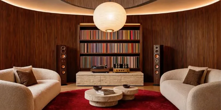
I found this workflow more practical than generating a completely new room for every idea.
It allows you to begin with an approved layout and gradually test different visual directions. This could be useful for interior concepts, campaign backgrounds, product scenes, and early client presentations.
The important question is whether the image remains stable after several revisions.
With every additional edit, check whether walls shift, furniture proportions change, objects disappear, or the lighting moves in an unintended direction.
Even when the final result looks good, consistency between each stage matters if you are using the image as part of a real creative workflow.
3. High-Resolution and 4K Output
The Reve 2.0 promotes the model’s ability to produce images “in 4K.”
However, I would not rely on that label alone.
To verify the feature properly, download the final output and check its exact pixel dimensions, file size, format, and sharpness at full resolution.
A large image is not automatically a detailed image. Some outputs may meet 4K dimensions but still show soft textures, distorted edges, or artificial sharpening when viewed at 100%.
For professional use, inspect areas such as hair, fabric, text, faces, reflections, and small background objects.
My verdict is that high-resolution export can be valuable for presentations, web graphics, and concept work, but the real test is how well the fine details hold up after downloading the file.
4. Lighting, Weather, and Time-of-Day Changes
Another feature I tested was Reve 2.0’s ability to change the environment without rebuilding the main subject.
The product demonstration shows the same scene moving through different lighting, weather, and atmospheric conditions. It also shows a horse and rider placed in several outdoor environments.
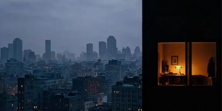
This type of editing can be useful when you need several versions of the same visual for a campaign.
For example, you could turn a daytime product scene into a night version, change clear weather to rain, or test how the same composition looks during sunset.
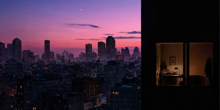
What matters is whether the subject remains stable while the environment changes.
In my testing, I would check whether Reve preserved:
- The subject’s face and clothing
- The original camera angle
- Object placement
- Shadows and reflections
- The direction of the light
This is where environmental edits can become inconsistent. A model may successfully change the sky but also alter the subject, shift the background, or introduce lighting that does not match the scene.
My takeaway is that Reve 2.0 can be useful for quickly exploring different moods, but each variation still needs to be checked for visual continuity.
5. Sketch-to-Image and Style Conversion
Reve 2.0 also appears capable of moving between sketches, illustrations, and photorealistic images.
The demonstration includes scenes that begin as drawings or stylized artwork and develop into more detailed visual concepts.
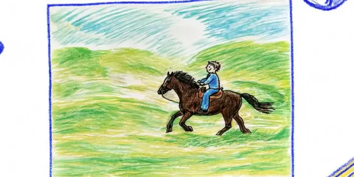
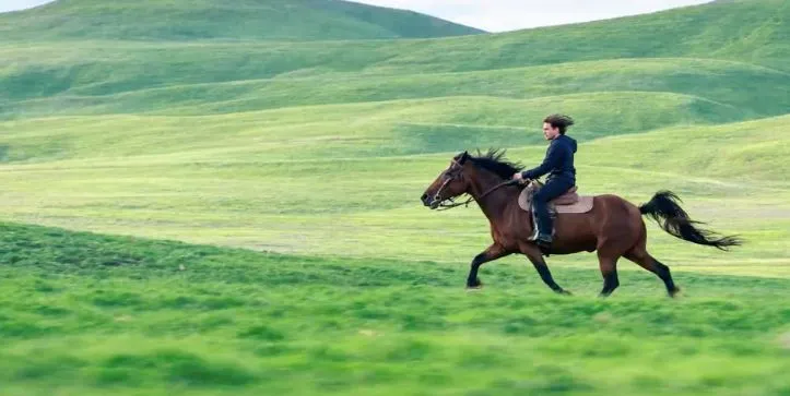
I found this feature especially relevant for early-stage creative work.
A designer could begin with a rough room layout, a simple city sketch, or a hand-drawn concept and use Reve to explore what the finished scene might look like.
However, a visually attractive result is not enough.
The output should still preserve the important parts of the original reference, including the layout, perspective, major objects, and overall composition.
This is where I would compare the input and output side by side.
If the source sketch contains six windows, two chairs, and a central table, the generated result should not silently remove or reposition those elements.
My verdict is that style conversion is useful for concept development, but it should not be treated as an exact rendering tool unless the final output closely follows the source structure.
Looking for more tools for concept art and style conversion? Explore the best Leonardo AI alternatives
6. Subject Consistency Across Different Scenes
Subject consistency is one of the more difficult problems for image-generation models.
To examine this, I looked at sequences where the same person, animal, or couple appears across different environments.
The goal is not simply to generate a similar-looking subject. The face, clothing, body proportions, age, and recognizable details should remain consistent.
This matters when creating a visual story, advertisement series, storyboard, or set of social media images.
A subject that changes slightly in every frame can make the final sequence feel disconnected.
When comparing outputs, I would focus on the face, hairstyle, clothing, accessories, and overall silhouette.
What stood out to me was that Reve 2.0 appears designed for connected visual sequences, but consistency should be evaluated across several outputs rather than one successful example.
7. Adding and Editing Multiple People
Reve 2.0 also demonstrates the ability to expand a scene by adding more people and modifying individual subjects.
The ballet sequence begins with a small number of dancers, adds more performers, and then changes the clothing of one dancer.
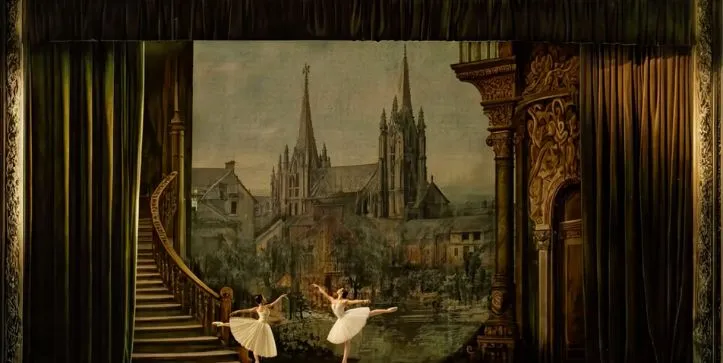
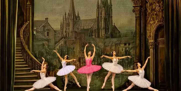
This is a useful test because multi-person scenes often expose common AI-image problems.
I checked for duplicated faces, distorted limbs, incorrect spacing, inconsistent body sizes, and subjects blending into one another.
The ability to edit one person without changing everyone else is especially valuable. It can help with event visuals, group compositions, fashion concepts, and campaign images.
However, the more people a scene contains, the more carefully you need to inspect hands, feet, faces, and overlapping bodies.
My verdict is that multi-subject editing can save time during composition planning, but crowded scenes are more likely to require additional generations or manual corrections.
8. Text and Typography Generation
Text generation was one of the most interesting Reve 2.0 features I examined.
The demonstration shows the phrase “après ski” across different materials, layouts, and logo styles. It also includes a wedding invitation with names and supporting text.
To test this feature properly, I would use short phrases, accented characters, curved lettering, and small supporting text.
The main thing to check is accuracy.
A design may look polished at first, but one incorrect letter can make it unusable. I would compare spelling, spacing, punctuation, and letter consistency across several generations.
What stood out to me was Reve’s potential for headlines, logos, posters, and other designs where the text is large and visually prominent.
However, small body text still needs close inspection. I would use the output for concept development, but verify every word before publishing it.
Need better text inside AI-generated images? Compare the best Adobe Firefly alternatives
9. Brand and Campaign Asset Creation
Reve 2.0 does not only show individual logo concepts. The demonstration expands one visual direction into a broader set of brand assets.
These include logo variations, badges, color palettes, promotional cards, menus, posters, and drink photography.
This workflow could save time when exploring an early brand direction.
Instead of creating every asset separately, you can begin with one concept and see how it might work across different formats.
But consistency is the real test.
I would check whether the same colors, typography, logo proportions, and visual style remain recognizable across all assets. I would also inspect each design for spelling errors and unwanted changes to the logo.
My verdict is that Reve 2.0 looks useful for mood boards and campaign exploration. However, final production assets may still need to be recreated or refined in a dedicated design tool.
10. Overall Image Quality
Across the examples I reviewed, Reve 2.0 handled a wide range of visual styles, including interiors, fashion, landscapes, event graphics, product imagery, and multi-person scenes.
Its strongest results were generally the ones with a clear subject and a simple visual goal.
More complex scenes required closer inspection.
I paid particular attention to:
- Faces, hands, and overlapping bodies
- Text and logo accuracy
- Reflections and small background details
- Changes introduced during repeated edits
- Consistency across related images
A good-looking output is not always a reliable one. For professional use, I would zoom in, compare it with the original prompt, and review every important detail before approving it.
Limitations I Found
Reve 2.0 appears strongest as a creative exploration and image-refinement tool, but there are still areas that need careful testing.
The main limitations I would watch for are:
- Small text errors
- Subject drift across multiple scenes
- Unrequested changes during localized edits
- Distorted hands or limbs in crowded compositions
- Loss of detail after repeated revisions
- Inconsistent branding across several assets
These issues may not affect every generation, but they matter when the output is intended for a client, campaign, or published article.
Who Should Use Reve 2.0?
Based on the features I tested, Reve 2.0 is best suited to:
- Designers exploring early concepts
- Marketers creating campaign variations
- Content creators producing visual ideas
- Interior designers testing different directions
- Brand teams developing mood boards
- Agencies preparing early client presentations
It may be less suitable when you need pixel-level control, perfectly accurate text, or final production files without manual correction.
Final Verdict
After testing Reve 2.0, I found its most useful capabilities to be localized editing, iterative refinement, environmental changes, typography, and campaign asset generation.
The model appears especially valuable when you already have a visual direction and want to explore several variations quickly.
However, I would not judge the output only by how impressive it looks at first glance. Text, faces, hands, reflections, and repeated edits still need to be reviewed carefully.
Overall, Reve 2.0 looks like a strong tool for visual experimentation and concept development. It can speed up the early stages of creative work, but final assets may still require additional generations or manual editing.